HAMILTON
TIGER-CATS
TEAM BRAND IDENTITY DEVELOPMENT
When entrepreneur Bob Young purchased his hometown football team, the Canadian Football League’s Hamilton Tiger-Cats, he acquired a franchise whose roots can be traced back to 1869. The logo he inherited, though not quite as old, was nevertheless long in the tooth by sports branding standards, and was difficult to implement effectively in modern-day applications.

Previous logo
New logo
The artwork did not accurately replicate the markings of a tiger and lacked clear definition. It was almost unrecognizable when reduced down to small sizes, and its imperfections were magnified when the marks were enlarged. What’s more, it did not translate well to embroidery, at any size.

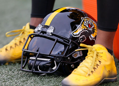

The club’s “leaping tiger” logo—the first of its kind on the professional sports branding landscape—had decades worth of equity and was beloved by the fans, which were the deciding factors when opting to base the focal point of the updated identity on the original pose.
Using a “less is more” approach, the fierce feline was cleaned up and simplified as part of an overhauled brand identity system that showed the franchise was moving forward while still maintaining a sense of tradition, appealing to both a new generation of fans as well as the vast legion of longtime Ti-Cats faithful.


Well done. You guys are good and you listen too. A rare combination.
– Bob Young, Owner, Hamilton Tiger-Cats